Friday, March 22, 2013

Whimsical Color/ Color Range

This week I wanted to share a shoot that was fun to plan, shoot and edit. I get a lot of questions about this shoot. Mostly about the props used, but that's a whole 'nother post. :) I made the head pieces and glasses out of flowers and potpourri. Stay tuned for a staging blog post where I will discuss that and many other tips and tricks I use to carry my work beyond my living room.

Anywho, in this post I wanted to show you how to change your images using the color range in Photoshop. So we'll start out with this image of Ariana. A most awesome model, who by the way did this entire shoot with a cast on her right hand. :) For this shoot I wanted something ethereal and whimsical, and...it needed to be done at my house. Everyone who has been to my house knows, there is no flower that is not artificial in my yard or my house. lol To pull off ethereal and whimsical was going to be a tall order. Lucky for me, my next door neighbor is one of those gardeners who couldn't care less whether or not their lovely pet project of the month is spilling on to your side of the yard or not. In this case, she had a vine with a mind of its own. Unfortunately it was not a flowering vine. But beggars can't be choosers. What was my point again? Oh...yeah...color range. So, I knew going into this shoot that anything whimsical would have to be added during the post process.  There's not really a way for me to add flowers into the image without it looking fake (at least not with my current skill level) so I decided to go with changing the color cast of the image and vines. The other point of this is to also showcase how one or two tweaks in Photoshop can really change an image. By no means is Photoshop a shortcut for good photography, but, it can certainly add extra oomph to an image. So here goes my second attempt at a helpful tutorial:

Here is the before image. No editing done yet.
 So on to color range.   The easiest way I found to use this feature was to use the color picker on the actual image, not the black box. For this image I clicked on all the green leaves and every variance of the color which is important. There are different shades in the picture due to the lighting so be sure to click on all the different shades.


Note:when you are choosing multiple colors make sure the plus symbol is chosen, this will allow you to add to the selection.
 Next: change the hue/saturation to the color you want.


That's really all it is to color range. :) For this image I also wanted to change the tone of the image to make it a little more ethereal. I used the gradient adjustment layer for that. You can see my other post on using  adjustment layers.


Here is a side by side of what the pics look like after just two easy adjustments.

And this is what the final edit looks like after a few more edits.

Here are more edited shots from that shoot:


 I also wanted to show another example of how I used color range to change an image. I started by first cropping the image to bring the focus closer to the subject, and to take away  more of the busy background.
Here is the before and after of that image. I changed the color of the flowers using color range.
Model Julia, MUA: AnaMary Valdes
Color range is a really easy tool to use in Photoshop and can give you more options for your editing. So never settle for an image you don't like. There are plenty of simple, quick ways to change a photo. Also, shout out to Tony Firpi for teaching me how to use it. :)

Friday, March 15, 2013

Adding color to your image

Recently I've received emails and messages on facebook regarding my editing style, and general questions about the things that I do photography wise. Well, I don't mind helping anyone and in fact really love sharing information with people. I'm self-taught and everything I learned came from research and asking questions of other photogs, so I'm never stingy with information. In the spirit of that I've decided to start blogging about different techniques I've learned and how I've applied them. I think of it as paying it forward. Mind you I'm not a consistent blogger, but this year I'll strive to change that.  I'm not a super technical person, so don't look for technical tips. I can tell you generally about F stops and shutter speeds, but since I don't retain information well, don't ask me why their relationship to each other is important. or why I used a certain shutter speed and F stop. LOL. My experience with photography is very tactile, so a lot of things I do are based on feeling. But, feel free to ask me anything regarding my method, and I'll certainly try to answer or direct you to where I got the answer. :) So, for my first, hopefully helpful, blog post regarding method I will explain my shoot 'Brawler' and how easy it is to change the color of an image with a gradient adjustment layer. Not only easy but quick, because let's face it, I ain't got the patience for a lengthy tutorial. Note: There are multiple ways to do anything in Photoshop, I'm only sharing the way I do things.

So last year make-up artist Andie Sleeman and I got together with model Annelise Adams to do an edgy beauty shoot. I wanted to show a street fighter, a brawler, a beautiful woman who was not afraid to fight. I wanted to show her beauty through the bruises. It was published in Ellements Magazine. You can see the entire editorial here.


 So here is the image I started with. This is with no edits. I used a monolight with a filter to get that red light in the corner of the image. The image isn't 'exposed' technically correctly, but was exposed for the lighting that I wanted.


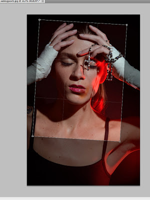
The first thing I did was crop and rotate the image to bring the focus closer in on her face.


I've read a ton of tutorials and Photoshop tips that tell you the best or easier way to edit is by using adjustment layers. They allow you to see all the changes on your image without actually touching your image layer. You can erase and adjust them at your leisure which is awesome. So if you adjusted the brightness and it looks crazy, you can go back and change it. I use these a lot because they allow you to stack changes on your image separately and independent of each other.

Anywho, for this particular shoot, I wanted to make the image a little more dramatic. I thought the color would add a harder edge to these image. So I added a gradient layer.
You can find it in either of the places I circled.


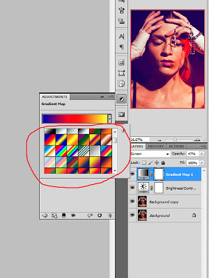
You can choose any of the colors in your gradients, depending on what look you want.                                                              
 Once you have your color, then adjust the layer mode to what best fits the look you want. In this particular one I chose screen and turned the opacity down to keep the color from overpowering the image. Again, all personal choices. Depends on how you want your image to look.

Note: Changing the layer mode is a good way to change the look of your gradient while keeping the same colors. 


 As you can see, the color changed drastically. In my opinion immediately it changed the mood of the image.

 So, after the color is changed. This is the best time to do any skin edits that you're going to do. I usually edit skin after I've chosen the color my image will be. Sometimes when you're cloning and healing the perfect matches that you accomplished with the skin one color will show up differently when you make universal color changes to the picture.

Once the color was done I fixed up the skin, made other adjustments and here is the finished image.  (I didn't go over all the other edits done to the image as this was on how easy your image could be changed with a simple gradient adjustment layer.)


Thursday, March 14, 2013

Sol Mate

I'm excited to finally be able to share another of my favorite editorials this year with you. It features Roarie Yum again, (who I am currently obsessed with) and make-up was done by MUA: Elayna Bachman. It was featured in Andivero's second issue which came out this month. You can check it out here: www.andivero.com. I called it Sol Mate, our vision was a woman who worshiped the sun much to her detriment. We wanted to do these really gnarly tan lines to show how long she would bathe in the sun. Elayna's idea for the tan line pattern was something very geometric, very clean. We also envisioned color blocking with the lipstick and nail color, so we played around with the same shape of the tan lines on the nails as well. Elayna mapped out the lines on Roarie's skin and proceeded to tan her within an inch of her life. LOL The results were so gorgeous. The lines you see on Roarie's skin is her actual skin color in comparison to the tan Elayna did on her. I put the pics that made it into the magazine on my facebook page, www.facebook.com/AdrienneAndersenPhoto , here are some of the pics that didn't make the issue.